Image Layout Examples in Blog Posts
A guide to using different image layouts in your blog content


Image Layout Examples in Blog Posts
When creating engaging blog content, the way you present images can significantly impact the reading experience. This post demonstrates various image layout options available in our blog system.
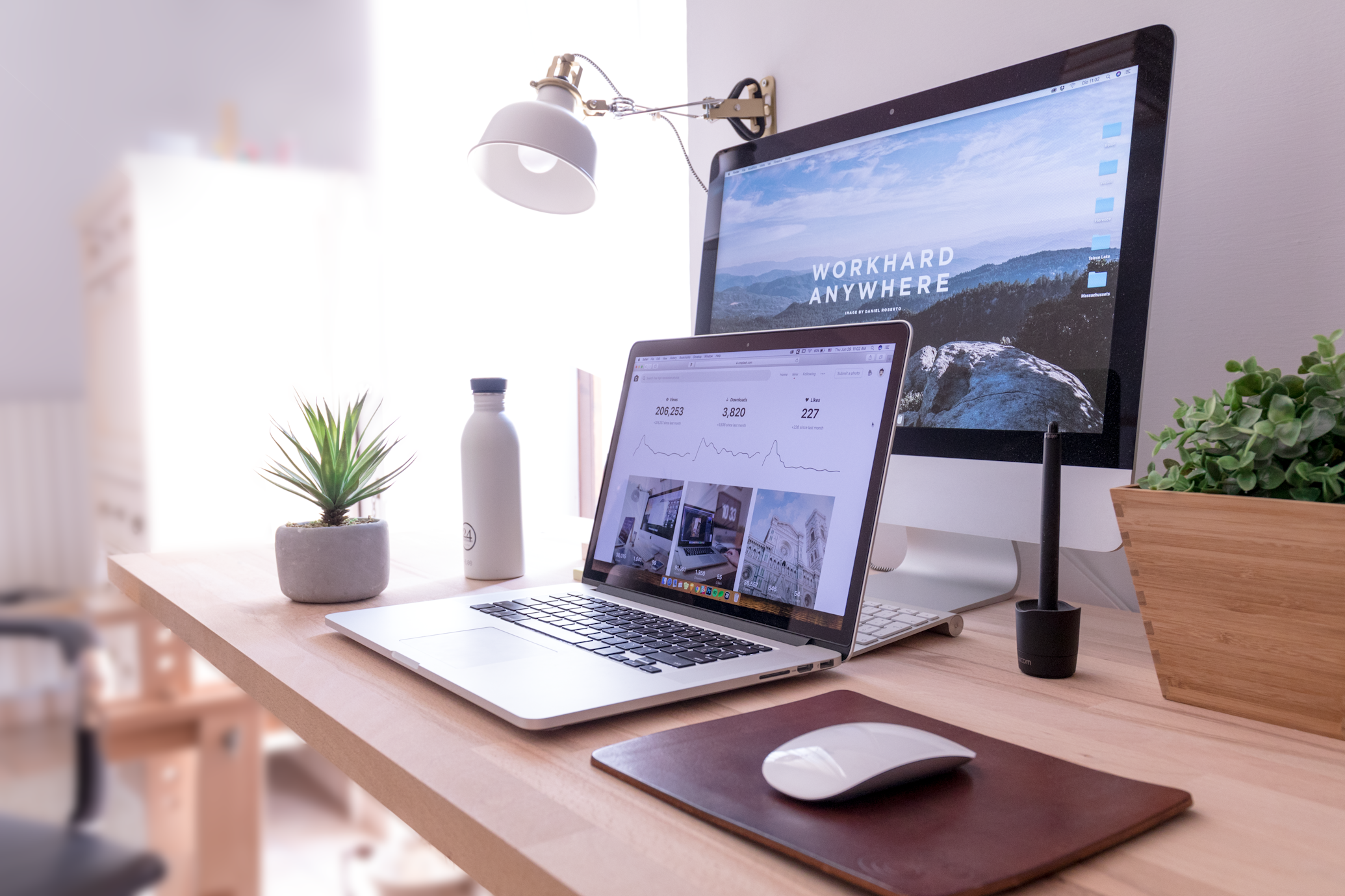
Full-Width Images
Full-width images span the entire width of the content area, creating visual impact and drawing attention to important visuals.

Full-width images work well for:
- Featured images at the top of posts
- Important diagrams or charts that need detailed viewing
- Scenic photographs or wide-format images
Left-Aligned Images

Left-aligned images allow text to wrap around the right side of the image. This layout works well for creating a magazine-style flow in your content. The image takes up approximately half the width of the content area and aligns to the left margin.
This layout is perfect for supplementary images that enhance your written content without dominating the page. As you can see, the text flows naturally around the image, creating a pleasant reading experience.
You can continue writing your content, and it will wrap around the image until you reach the bottom of the image or use a clear-float element.
Right-Aligned Images
Right-aligned images function similarly to left-aligned ones, but they sit on the right side of the content with text wrapping around the left.

This layout creates visual variety and can be alternated with left-aligned images to create a dynamic flow throughout your blog post. Right-aligned images work well for:
- Supplementary visuals that enhance your written content
- Product images in review articles
- Profile pictures in interview-style posts
- Screenshots of mobile applications
The text continues to flow around the image, creating a cohesive reading experience. You can continue writing your content until you reach the bottom of the image or decide to clear the float.
Medium-Centered Images
Medium-centered images occupy about 70% of the content width and are centered on the page.

This layout strikes a balance between the visual impact of full-width images and the space efficiency of smaller images. Medium-centered images are ideal for:
- Important visuals that don't require full-width display
- Photographs that are the main focus of a section
- Diagrams or charts with moderate detail
Small-Centered Images
Small-centered images take up only about 30% of the content width and are perfect for icons, logos, or small visual elements.
These compact images are useful for:
- Logo displays
- Author avatars
- Small icons or symbols
- App icons in tech reviews
Images with Captions
Sometimes you need to provide additional context or attribution for an image. The caption style allows you to add descriptive text directly below the image.
 A diverse team collaborating on a digital project. Photo by Christina @ wocintechchat.com on Unsplash.
Captions are perfect for:
- Providing image credits or attribution
- Adding explanatory notes to diagrams or charts
- Offering additional context about the image
- Describing what's happening in the photograph
Responsive Behavior
All these image layouts are fully responsive. On smaller screens like mobile devices, the left and right-aligned images will automatically stack and become full-width to ensure readability on smaller displays.
How to Use These Layouts
To use these layouts in your markdown content, simply add the appropriate class to your image HTML:
<!-- Full-width image -->
<img src="image-url.jpg" alt="Description" class="img-full" />
<!-- Left-aligned image -->
<img src="image-url.jpg" alt="Description" class="img-left" />
<!-- Right-aligned image -->
<img src="image-url.jpg" alt="Description" class="img-right" />
<!-- Medium-centered image -->
<img src="image-url.jpg" alt="Description" class="img-medium" />
<!-- Small-centered image -->
<img src="image-url.jpg" alt="Description" class="img-small" />
<!-- Image with caption -->
<img src="image-url.jpg" alt="Description" class="img-with-caption" />
<span class="caption">Your caption text here.</span>
<!-- Clear float after left/right images if needed -->
<div class="clear-float"></div>